WageWise
Smarter Information Architecture for an Early Wage Access Application
INTRODUCTION
MY ROLE
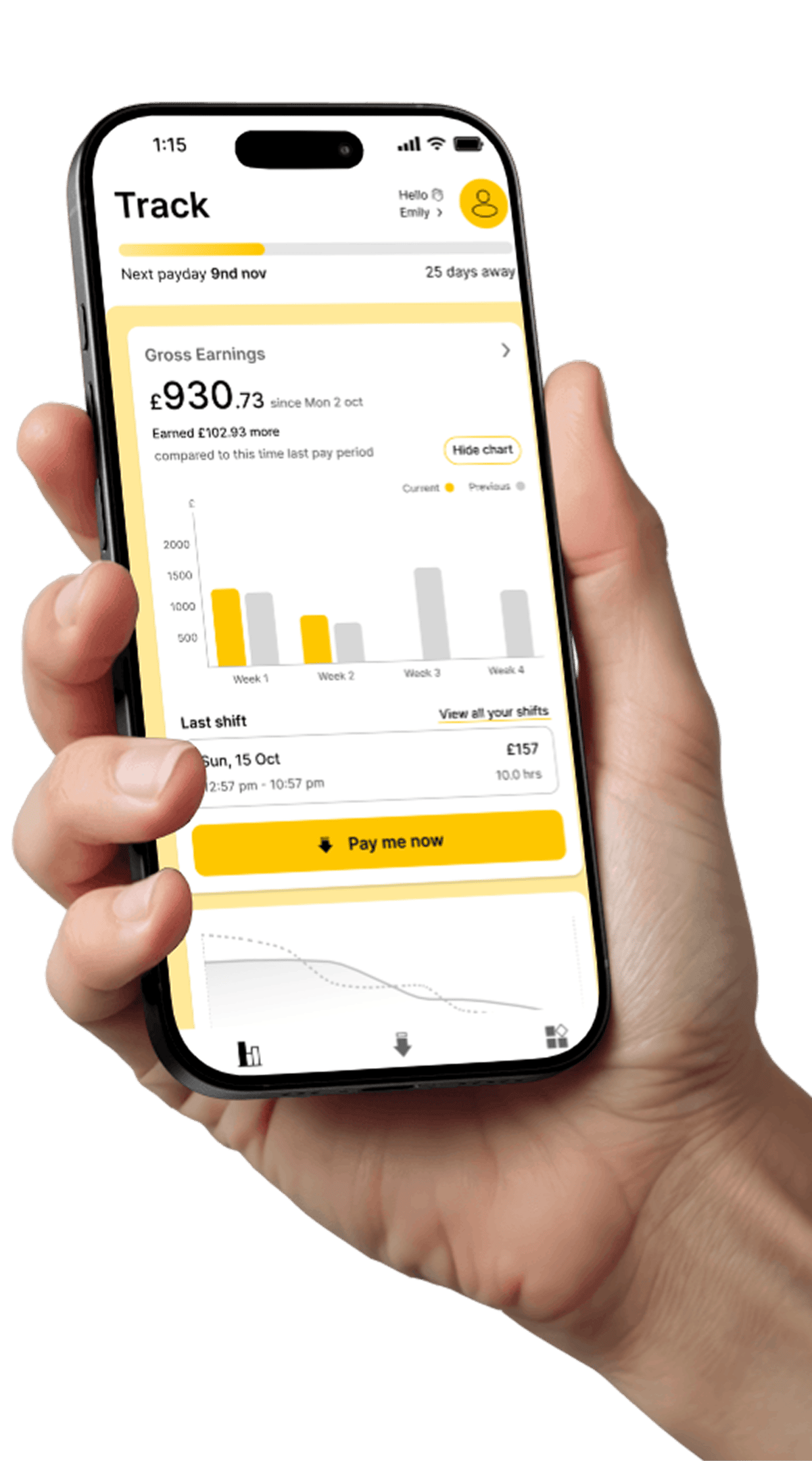
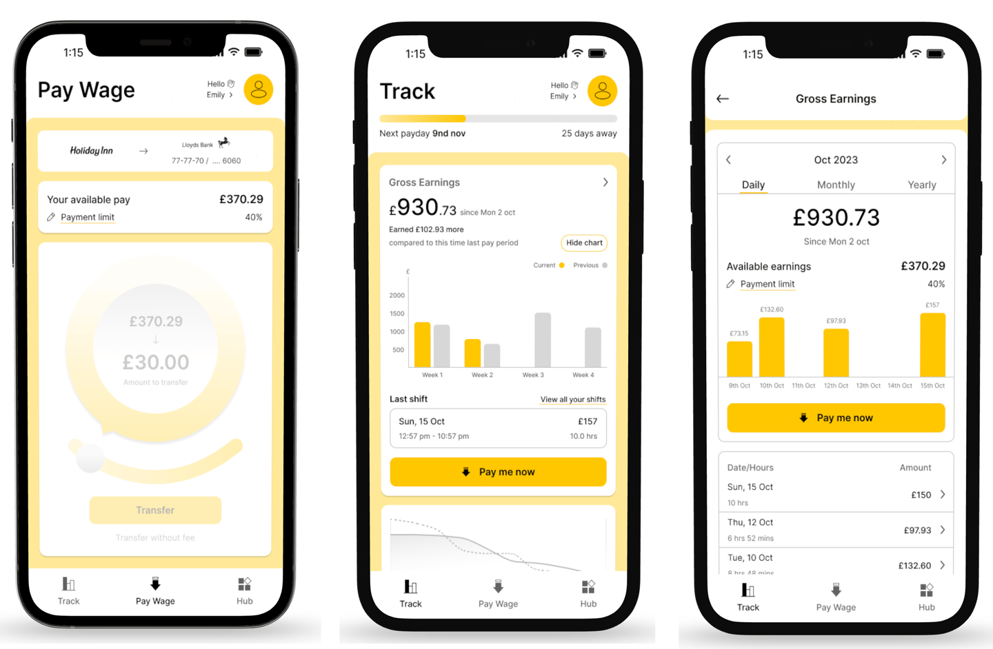
Wage Wise simplifies financial management for employees with its early wage access platform.
Easily request a portion of your earned wages before payday, track earnings, set goals, automate savings, manage loans, and handle finances all in one digital hub.
As part of a student assignment at UX-land school, I worked in a team of two on an adaptive application, focusing on developing user-centric information architecture and usability. My responsibilities included defining scope, creating user flows, wireframes, and prototypes to improve navigation.
I also conducted user research and turned insights into design improvements for a simpler, better experience.
PROJECT SCOPE
A squad of designers, 4 Weeks (remote)
TOOLS
Figma,Zoom,Photoshop,Canva
The adoption of certain features needs to increase.
Insight 1
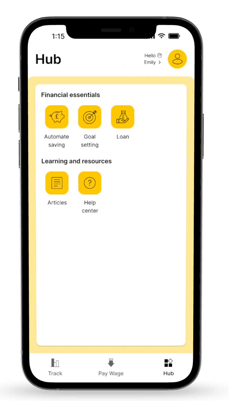
Design Decision (Hub-focused): Reorganized the Hub so core actions (Automate Saving, Goal Setting, Loan) are shown as distinct cards with clear labels and CTAs, and separated essentials from resources.
Insight 2
Design Decision: Used the Hub as the single place for feature discovery: grouped features into Financial essentials vs Learning & resources to make all options clear and accessible in one place.
All features & solutions must be clearly visible.


Insight 3
Users needed more motivation to stay engaged with their goals.
Design Decision (within Goal Setting): We added a time prediction (You’ll reach your goal by Aug 2024) along with supportive microcopy, so users can see how their regular contributions add up and feel motivated to stay on track.
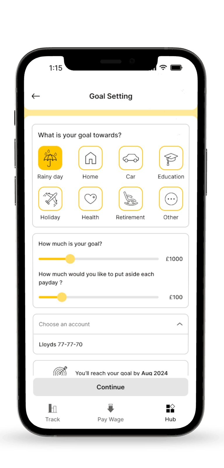
Optimizing the information architecture through research and testing to improve access to core features.
Our Solution
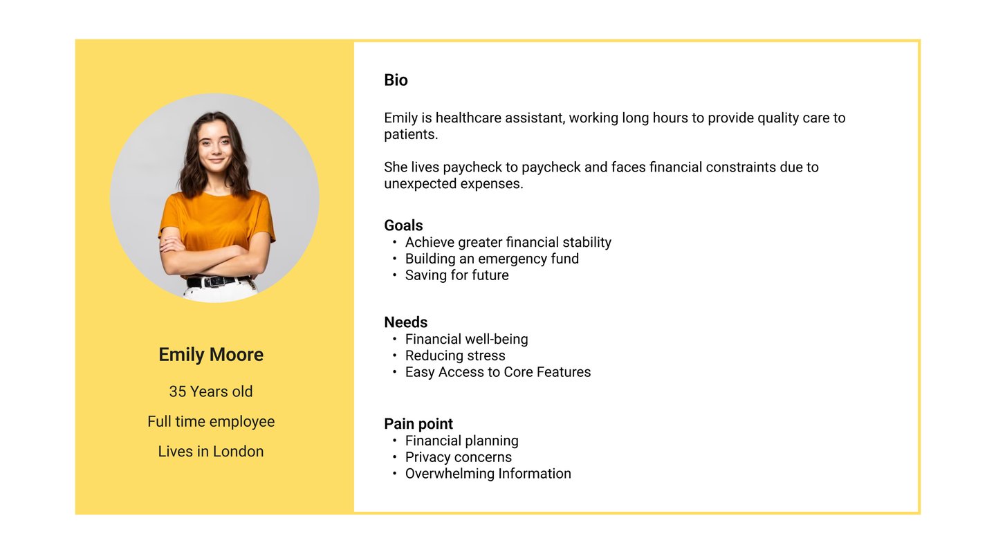
This case study focused on the employee persona.
Analysing Market & Competitions
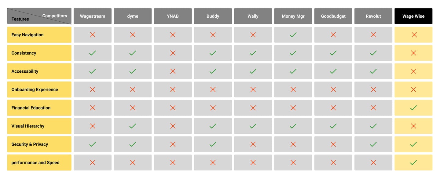
In the continuation of the research, we prepared a list of competitors and similar sites and examined them. After analyzing them, we found out what facilities are available in other similar sites.

take Away
Our analysis of competitor websites showed that the WageWise app lacks key features in navigation, onboarding, and consistency, which are essential for user engagement. While it performs well in security and speed, enhancing usability and adding these features could improve the user experience.
Interview & Affinity Diagram
The Process
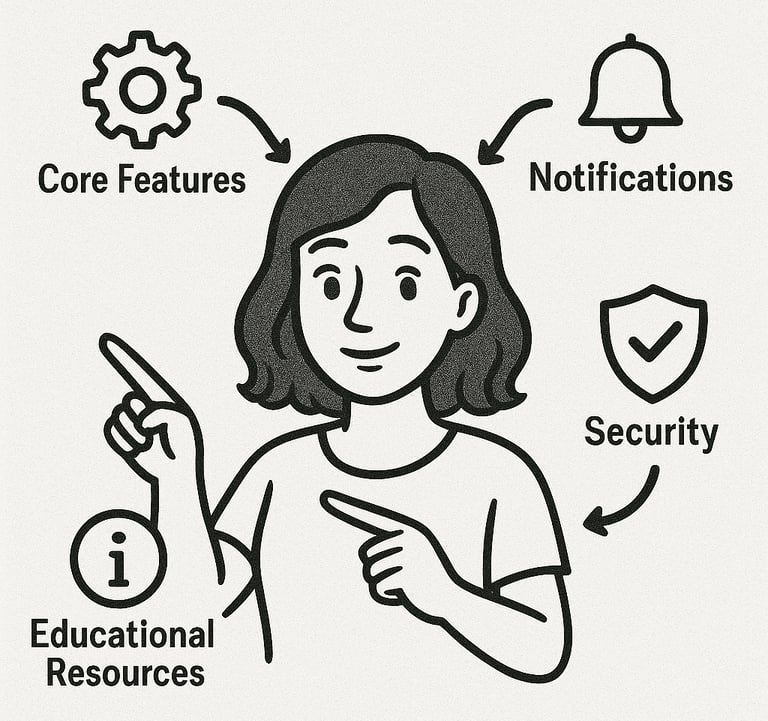
We followed up with 15 participants to better understand their pain points.
Users need easy access to core features like goal setting and saving automation.
Users wish to see notifications in the app to stay informed about their shifts, next payday, available pays, and any important updates regarding their earnings.
They worry about the security of their financial information and personal data.
Users are experiencing a lack of educational resources on financial tasks.
DEFINE
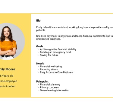
Persona
Site Map
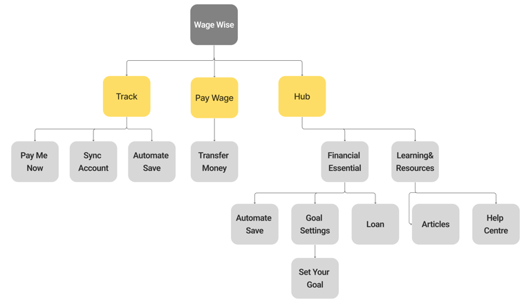
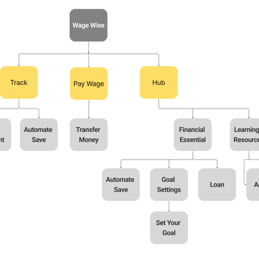
After performing card sorting and various iterations, we have reached this site map.
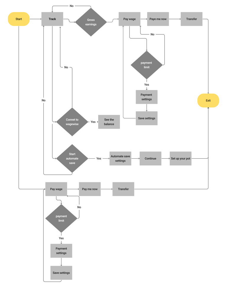
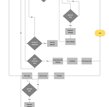
User Flow
DEVELOP
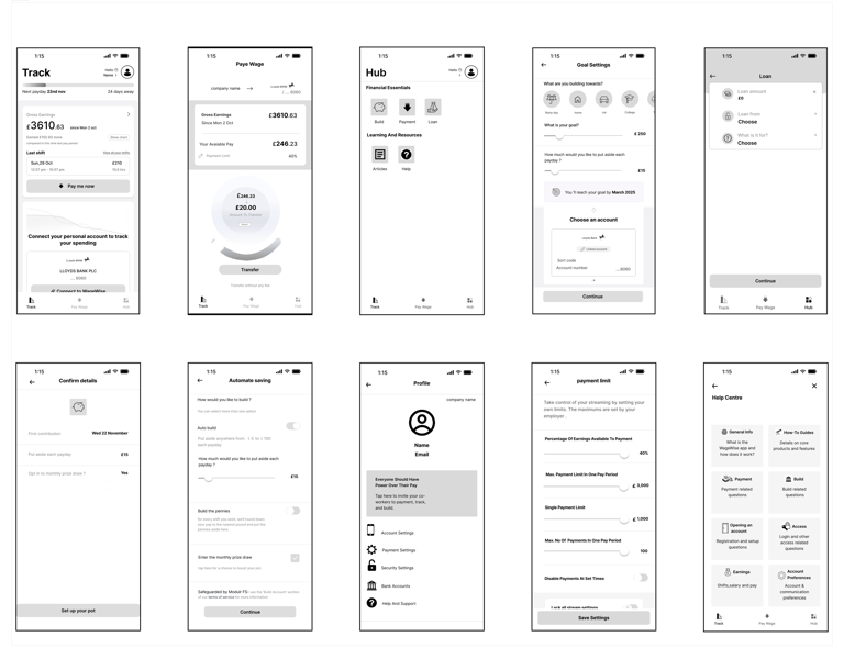
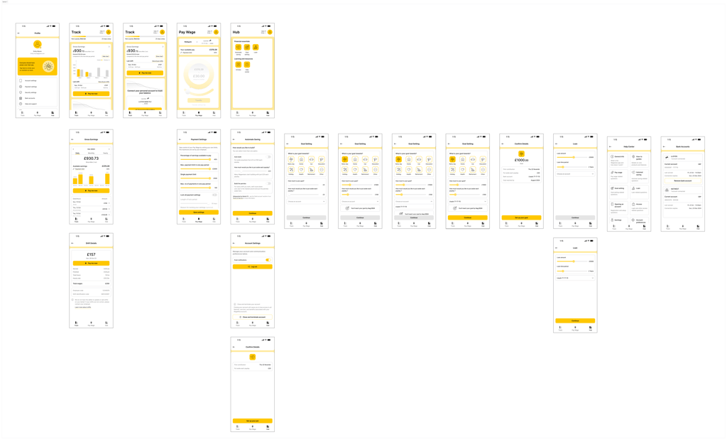
Wireframes
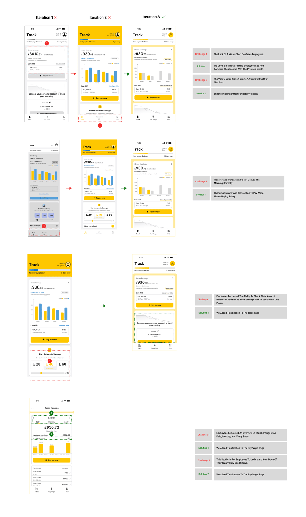
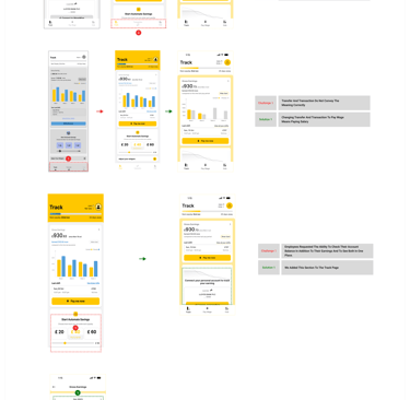
Usability Test & Iteration
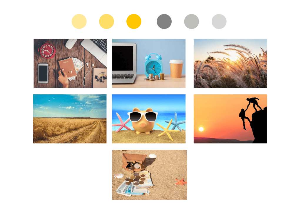
Mood Board & Color Palate

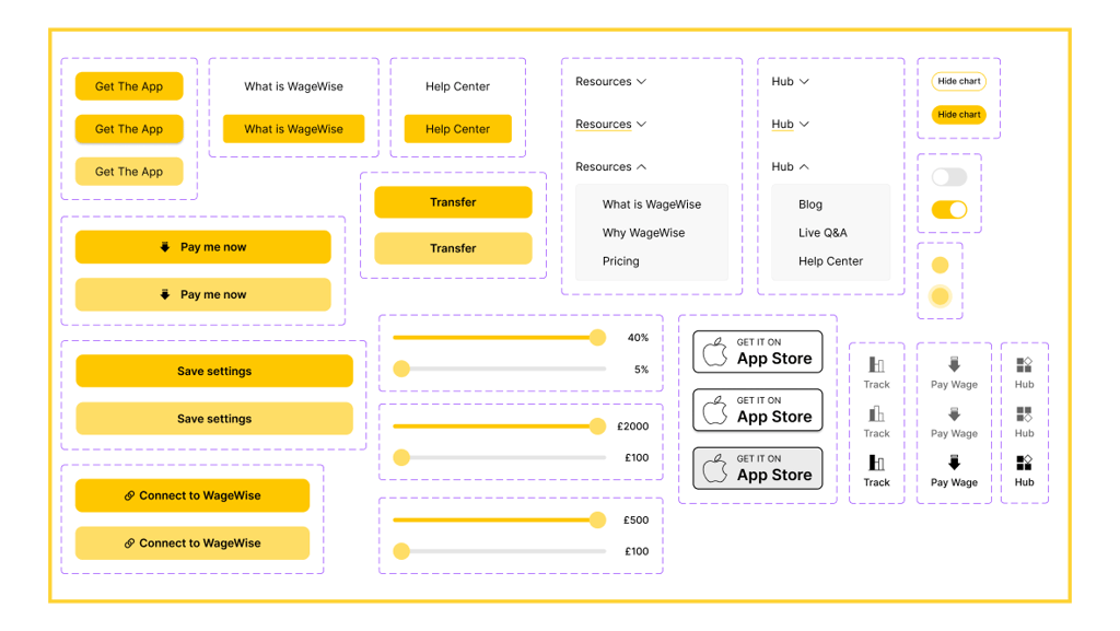
UI Kit
DELIVER
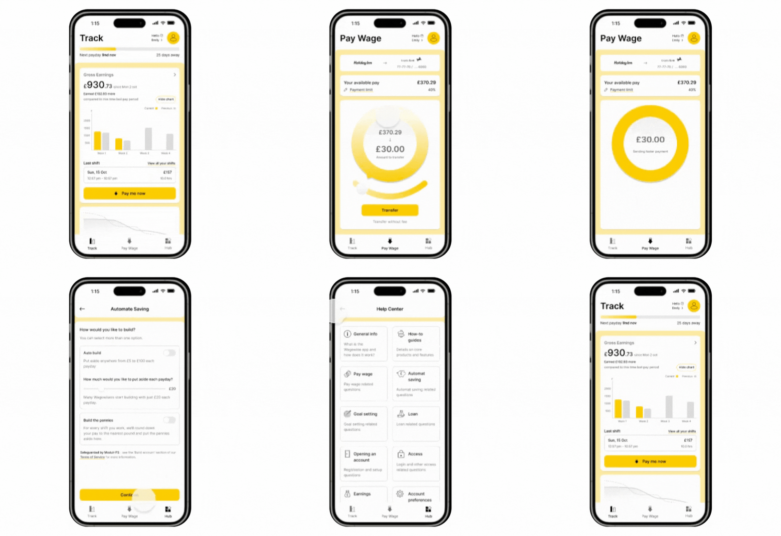
High-Fidelity Prototype

REFLECTION
What did I learn?
Being a member of the team allowed me to learn how important constant communication can be, particularly early in the project.
In my role as a UX designer, I have learned the necessity of iterations and how to cope with unexpected changes and client expectations.
What can we do next?
Aim to develop and work on the set goal task
keep updating the interface of the application by considering user feedback & stakeholders strategies.