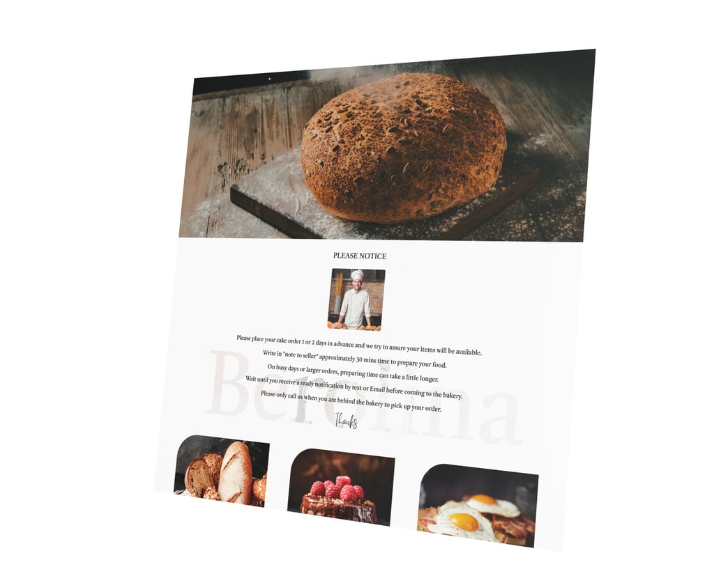
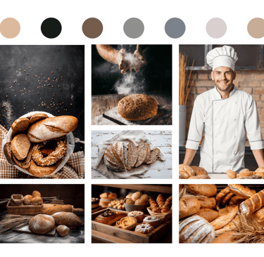
Berolina Bakery in California, run by a European couple since 1991, offers artisan breads, pastries, croissants, European cakes, lunch option , and beverages.
PROJECT OVERVIEW
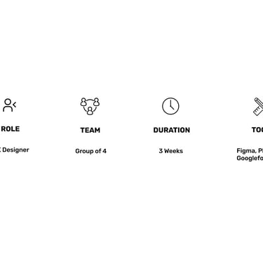
I worked with three UX designers to improve the Berolina Bakery website. Our task was to simplify navigation and checkout. I focused on improving the purchase flow and information architecture.
BUSINESS ANALYSIS
Solution
The main goals for redesign the Berolina Bakery website include:
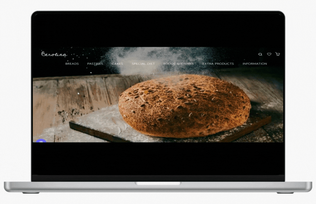
Organize navigation, add a breadcrumb trail, and use a fixed header for quick access.
Simplify checkout by reducing steps and consolidating information.
Provide instant feedback, like a popup or cart animation, when items are added.
Update the design with modern colors, fonts, and interactive elements to improve engagement.
Design Approach
Heuristic evaluation.
Interviewed potential users to understand their concerns and needs.
Competitive analysis.
Problem
Confusing navigation makes finding products and completing purchases difficult.
The unclear, lengthy checkout process frustrates users.
The website lacks clear feedback, leaving users unsure if items were added to the cart or checkout completed.
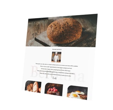
The site lacks product photos, effective search tools, and strong visual or interactive design.
THE PROCESS
Our team of four ran a Double Diamond Design based on the design thinking methodology. It was not a linear path, we bounced between stages as the project progressed.
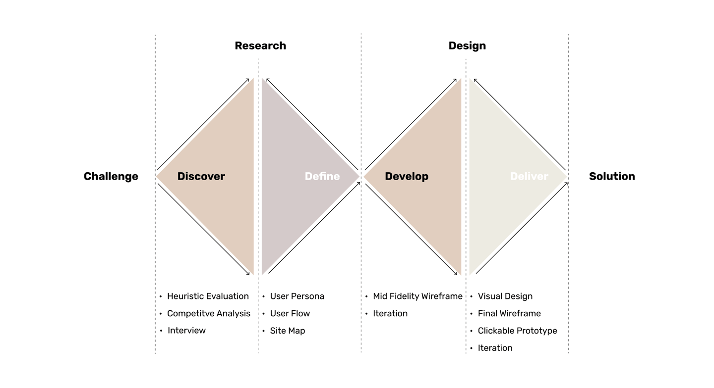
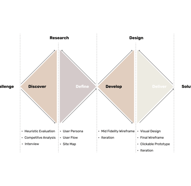
DISCOVER
Heuristic Evaluation
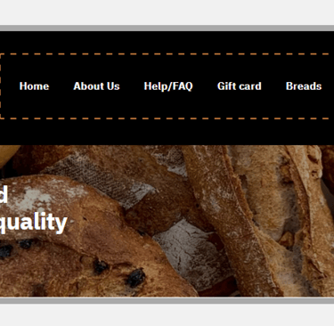
1.Complex navigation: The navigation bar is busy with too many links, lacks organization, and doesn't separate primary from secondary items, making it difficult to navigate. The lack of dropdowns or submenus also limits browsing efficiency.
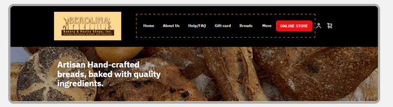
2. The text on the page is misaligned
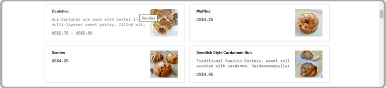
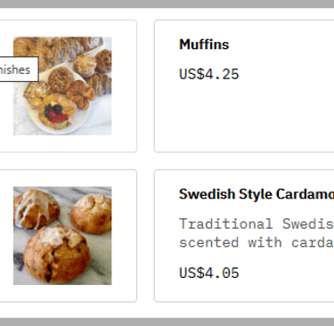
3.There's a mismatch between products and their images, causing confusion and inconsistency.
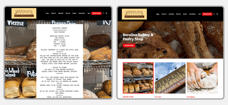
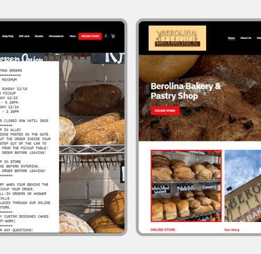
4.there are two homepages which is confusing
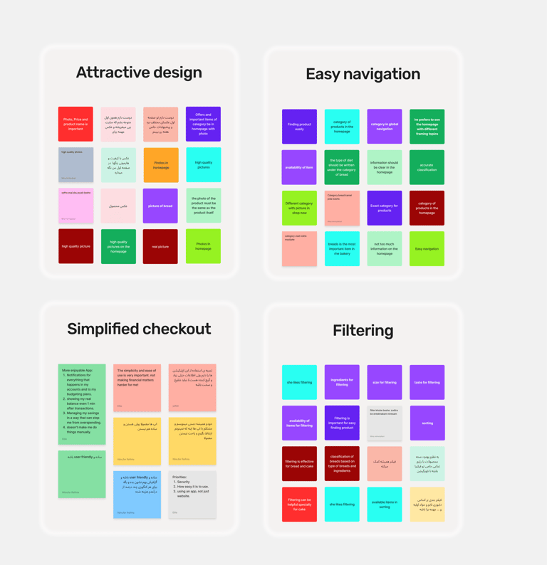
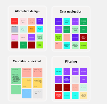
Interview & Affinity Diagram
Then we followed up with 15 participants to better understand their pain points.
The major takeaways from this research are:
1.Easy navigation :Users need clear, organized menus to find products easily.
2.Simplified checkout: Users need a quick, simple checkout process with clear steps.
3.Attractive design: Clean, user-friendly layouts
Competetive Analysis
These are some of our potential competitors and various websites we dug into for inspiration.
Overall, it helped us with some visual design ideas.
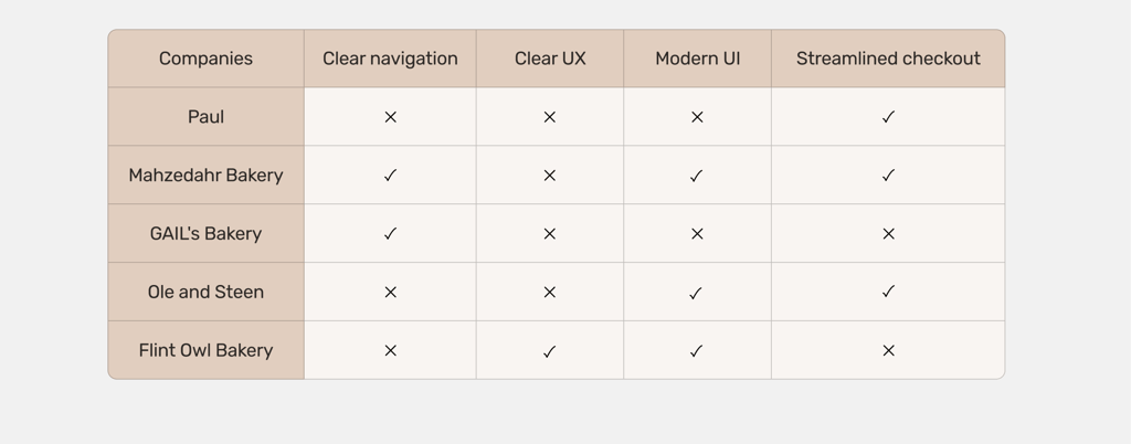
Simplifying navigation and checkout emphasized their importance in improving user retention and satisfaction.
key takeaways:
DEFINE
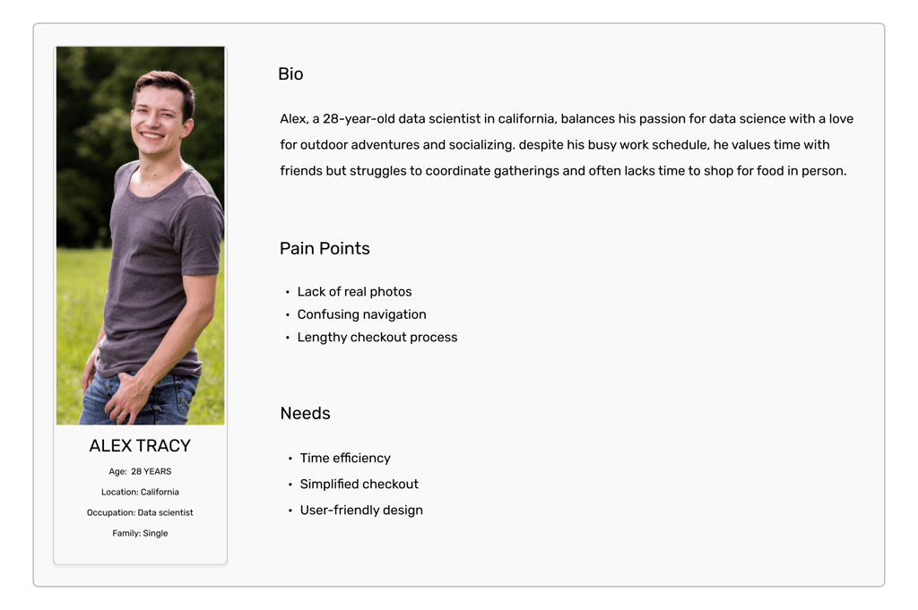
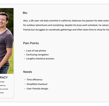
Persona
The website will be redesigned based on the Persona's needs and preferences.
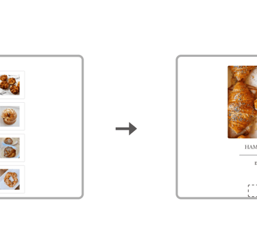
Site Map
The results from our analysis of the card sorting activity led to the redesign of the information architecture and site map.
User Flow
User flow was developed accordingly:
DEVELOP
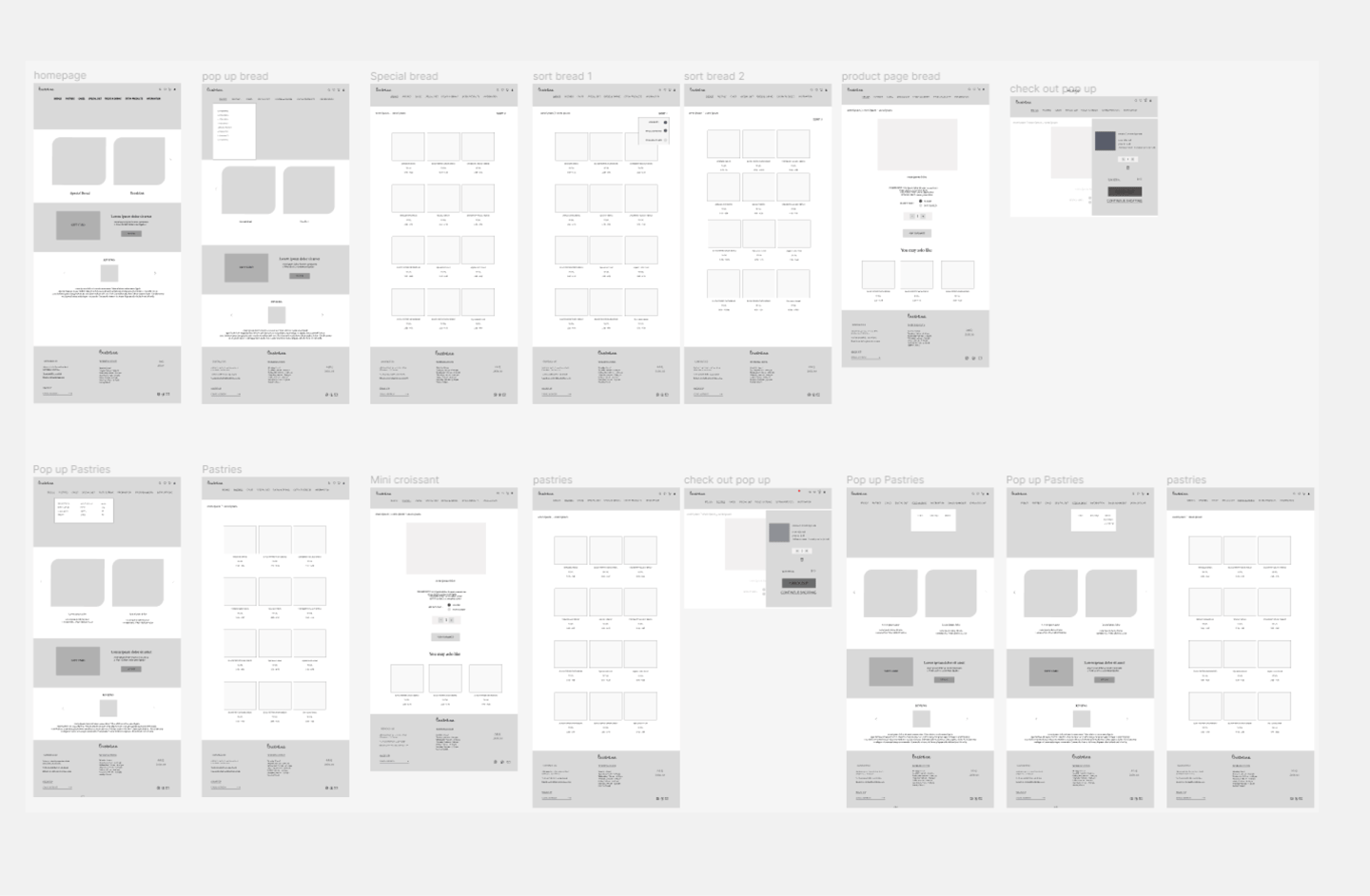
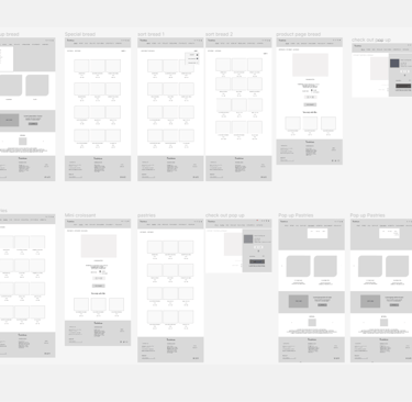
Wire-Framing
DELIVER
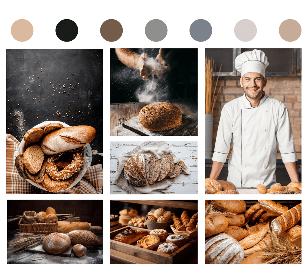
Mood board & Color palate
Usability & Iteration
Problem 1
Solution 1
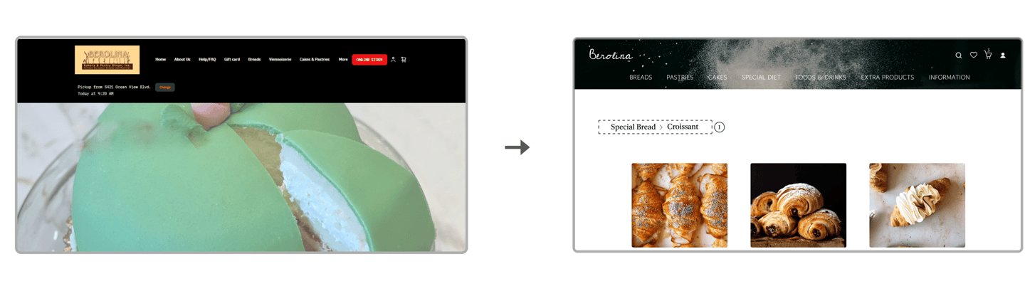
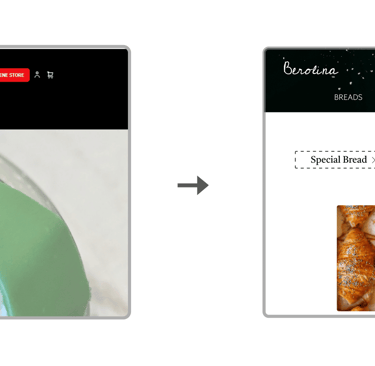
The original design lacked breadcrumbs, which often left users feeling lost when navigating the site
The redesigned version included clear breadcrumbs, helping users easily track their location and navigate back to previous pages.
Problem 2
Solution 2
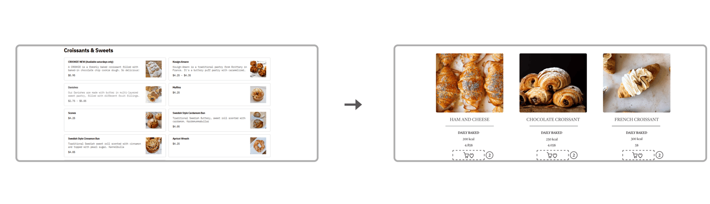
The previous design lacked a wishlist and basket, making it harder to save or view items.
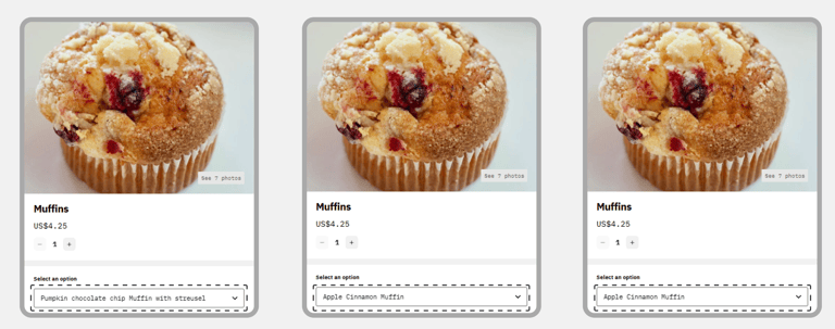
The redesign added a wishlist and basket, simplifying shopping and earning positive feedback.
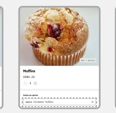
Problem 3
Solution 3
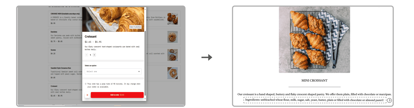
The previous design lacked this feature, leaving users uncertain about product details.
The redesigned version added ingredient listings, giving users essential information and improving their shopping experience.